
Charcoal + Chalk Pastels
(Click images for more information in this section)
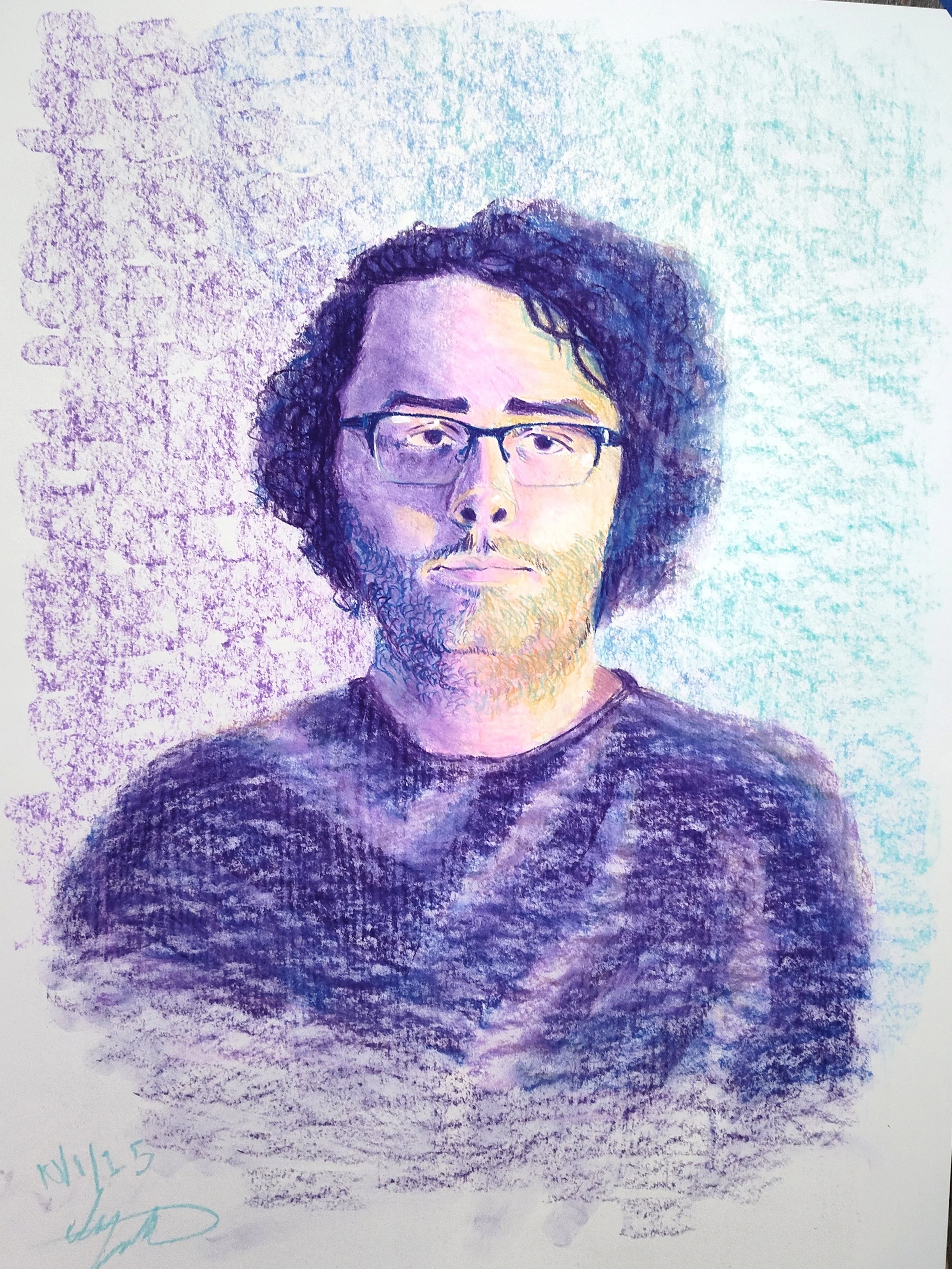
Portrait
22” x 30” (2025) Chalk Pastels, Pencil, and Acrylic Paint
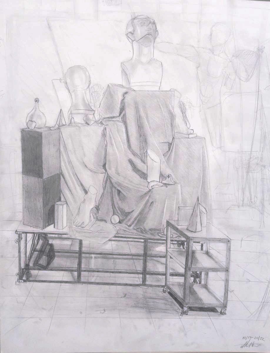
Still Life
18” x 24” (2022) Pencil
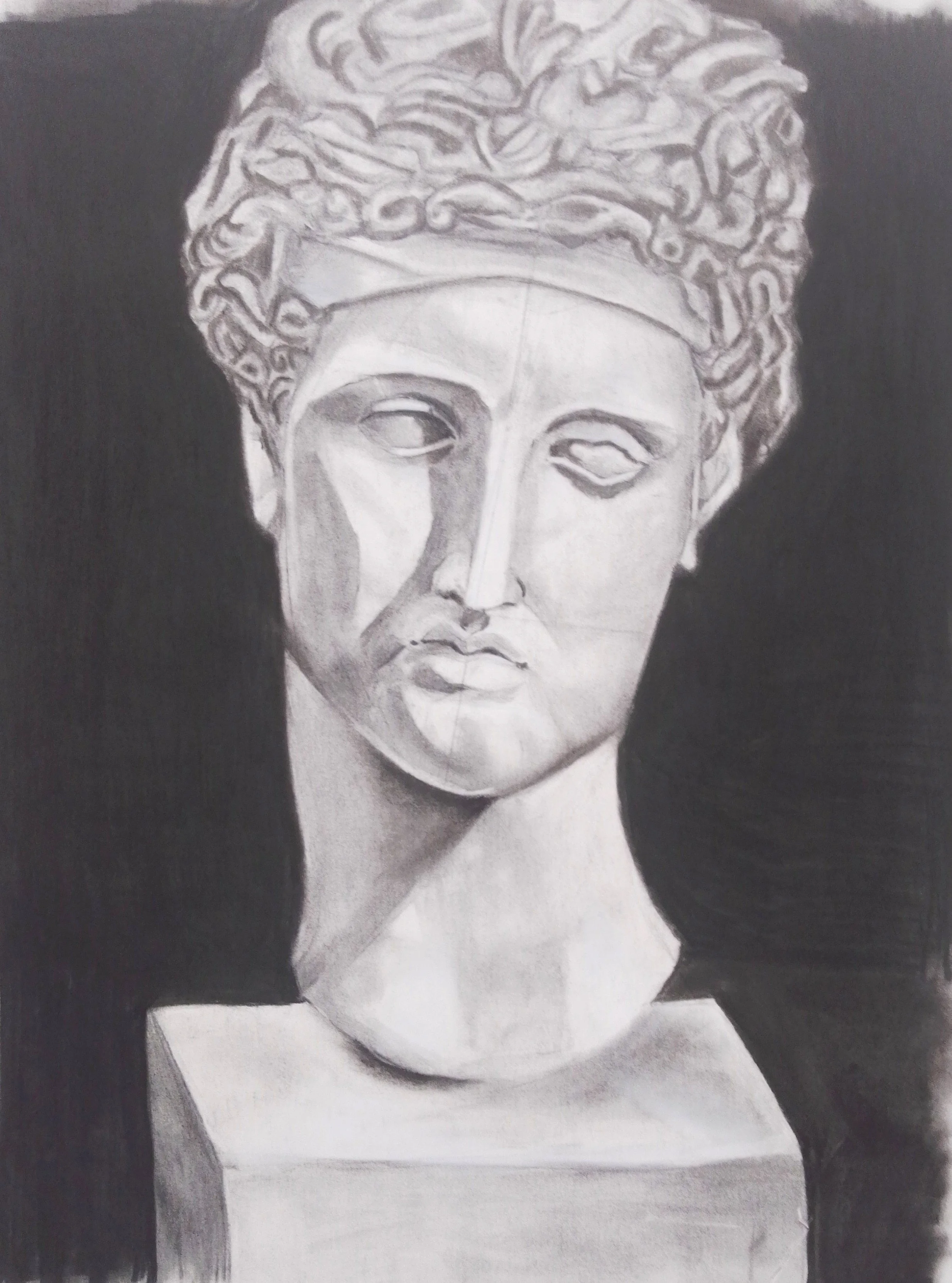
Still Life of Statue
18” x 24” (2022) Charcoal

Snoozella
18” x 24” (2024) Charcoal, Pencil, and Chalk Pastels

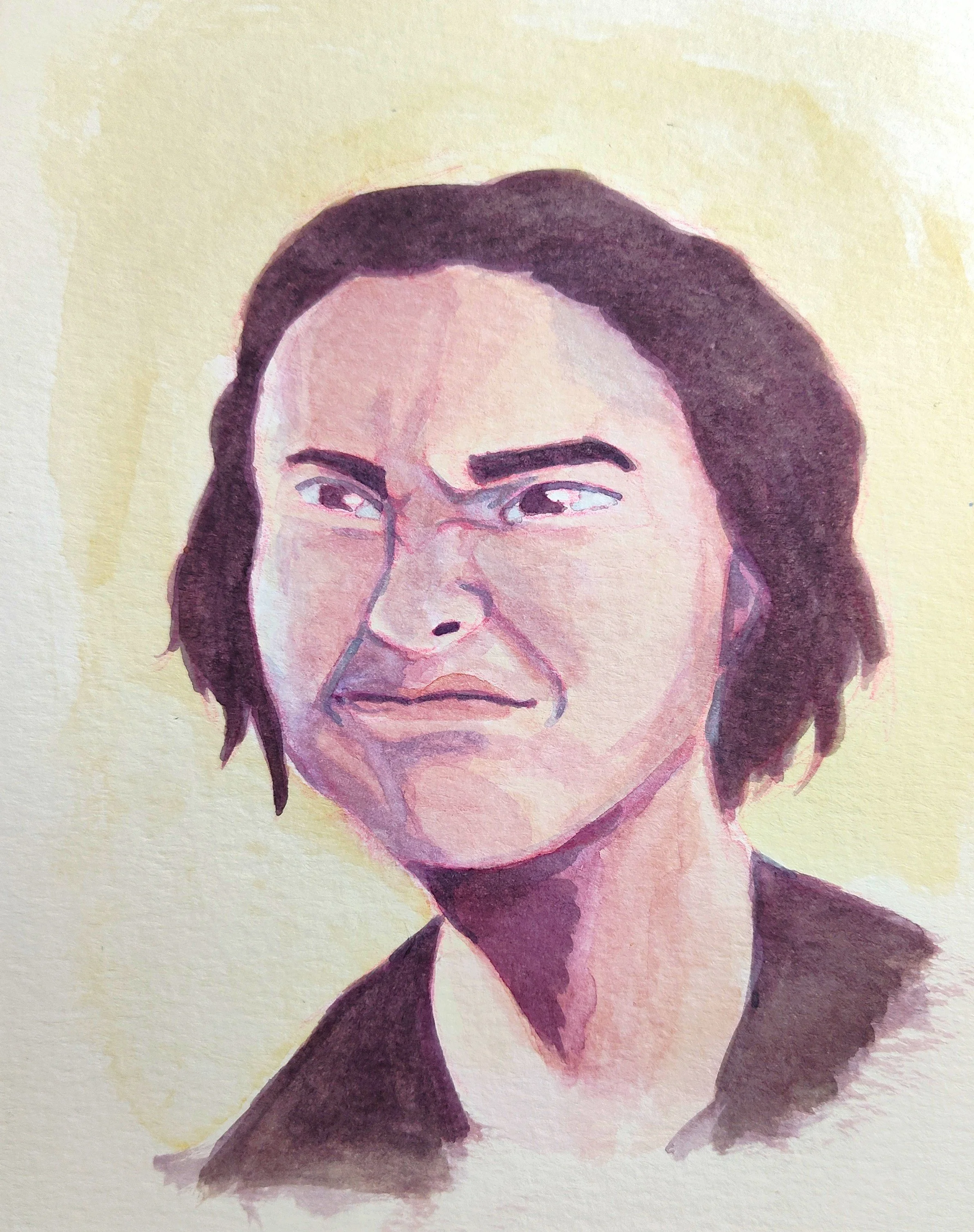
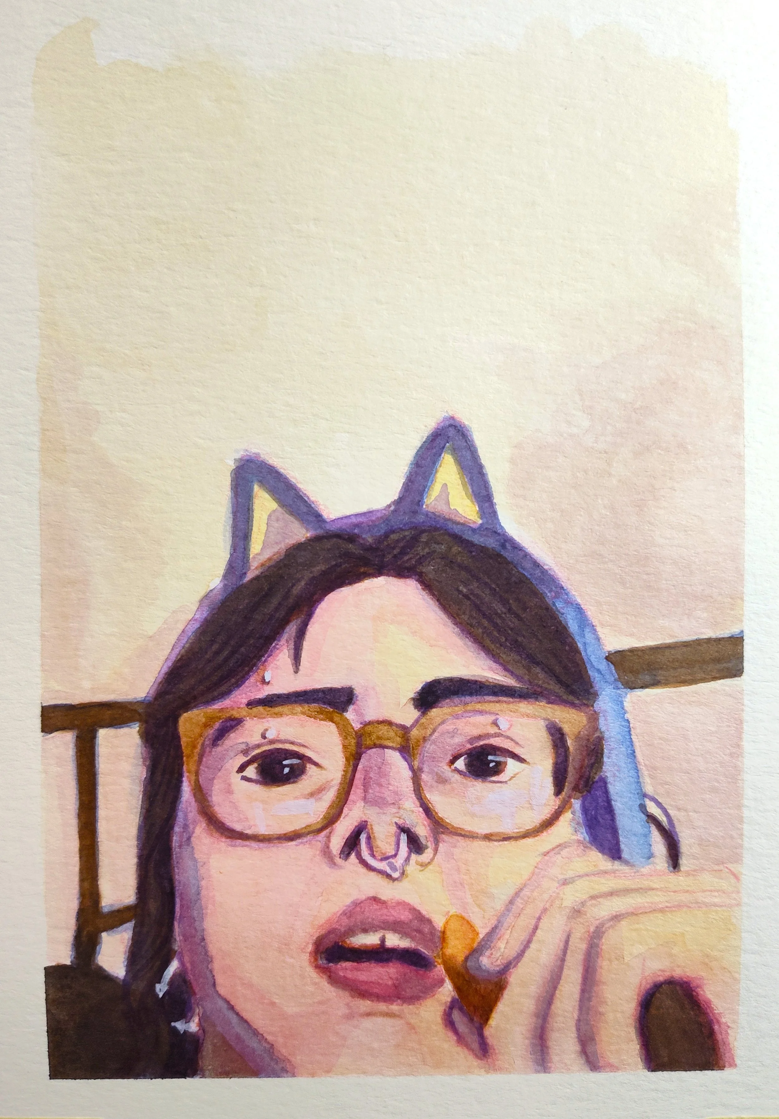
Watercolor Portraits
5 1/2” x 7 1/2” (5 1/2” x 7 3/8”) (2025)
I may or may not have enjoyed taking a watercolor course, as much as I detest of the medium. This series only contained three paintings, all portraits of my friend Dee Silva throughout the years that I’ve known them. Sometimes they reply to my text messages with pictures of themselves making funny faces as reaction images. I used these as reference images, and sketched out their features lightly with a red erasable pencil, layered watercolors lightly until I was happy with the depth and then used white gouache as highlights in certain spots. Dee’s a very fun and bubbly person, so I wanted to keep all the colors warm and bright to express that through the medium.

5 1/2” x 7 1/2”
5 1/2” x 7 3/8”
5 1/2” x 7 1/2”
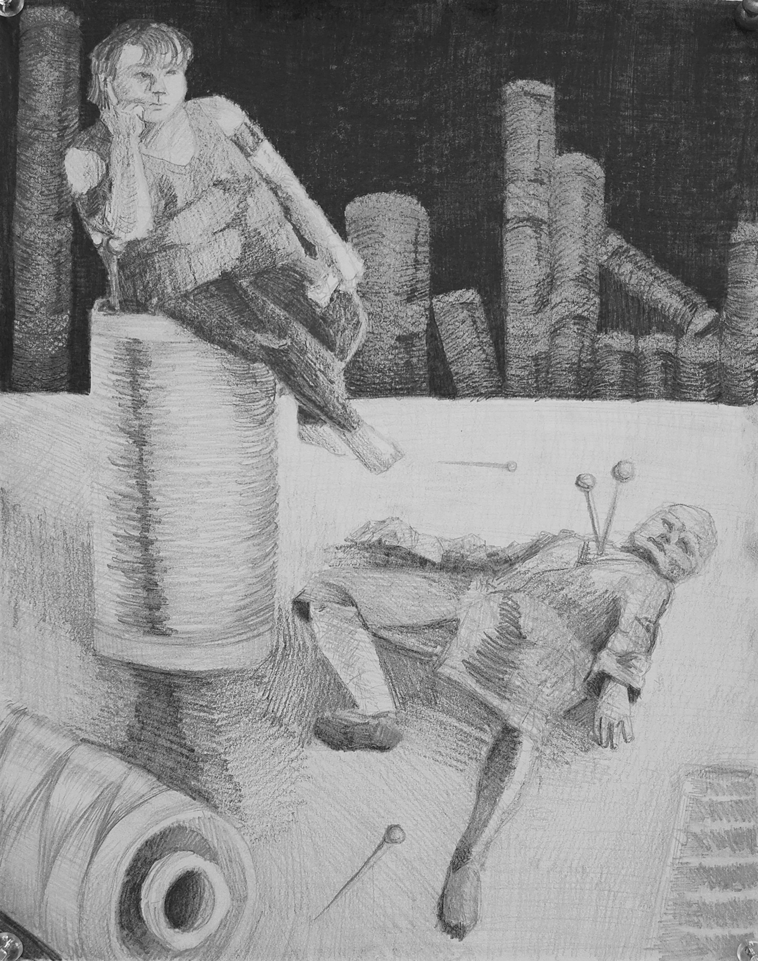
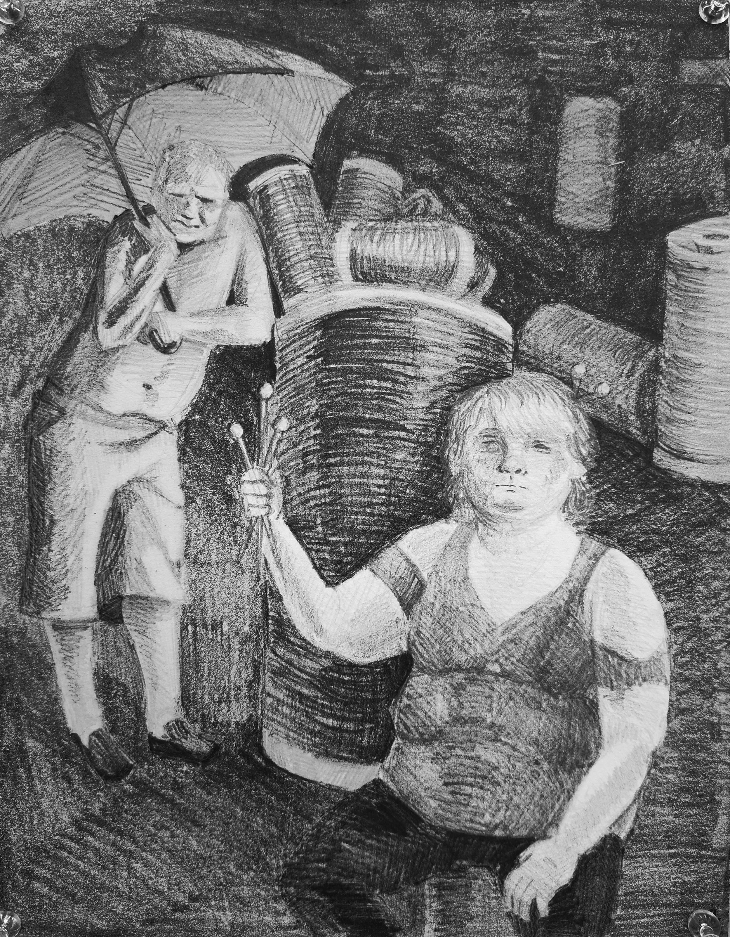
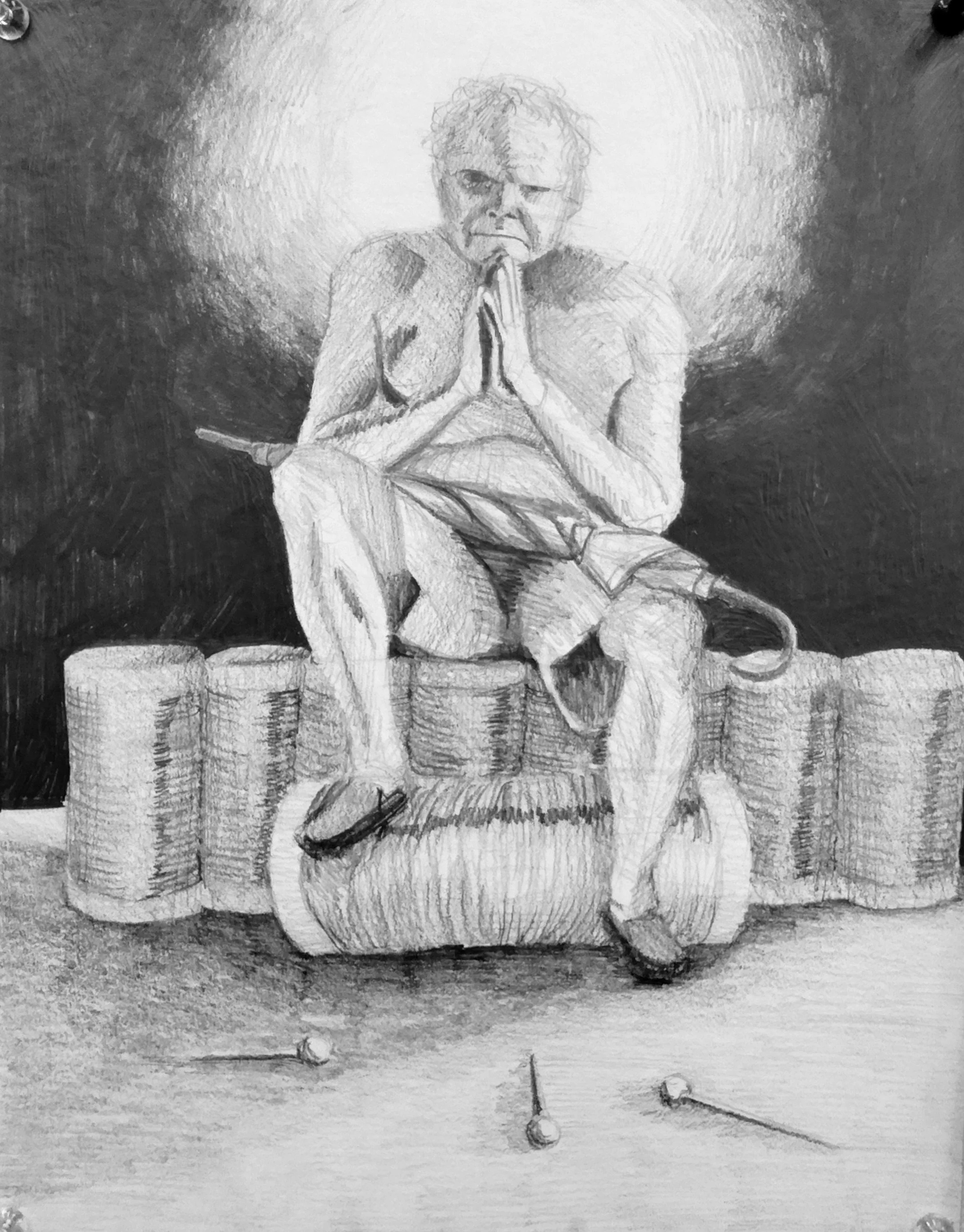
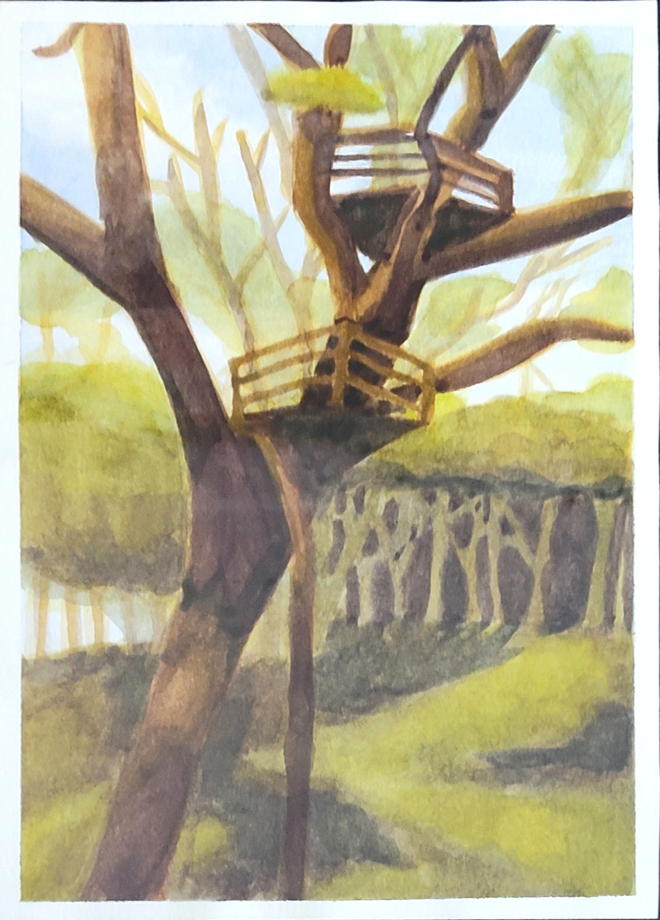
Thread Kingdom
8 1/2” x 11” (2025)
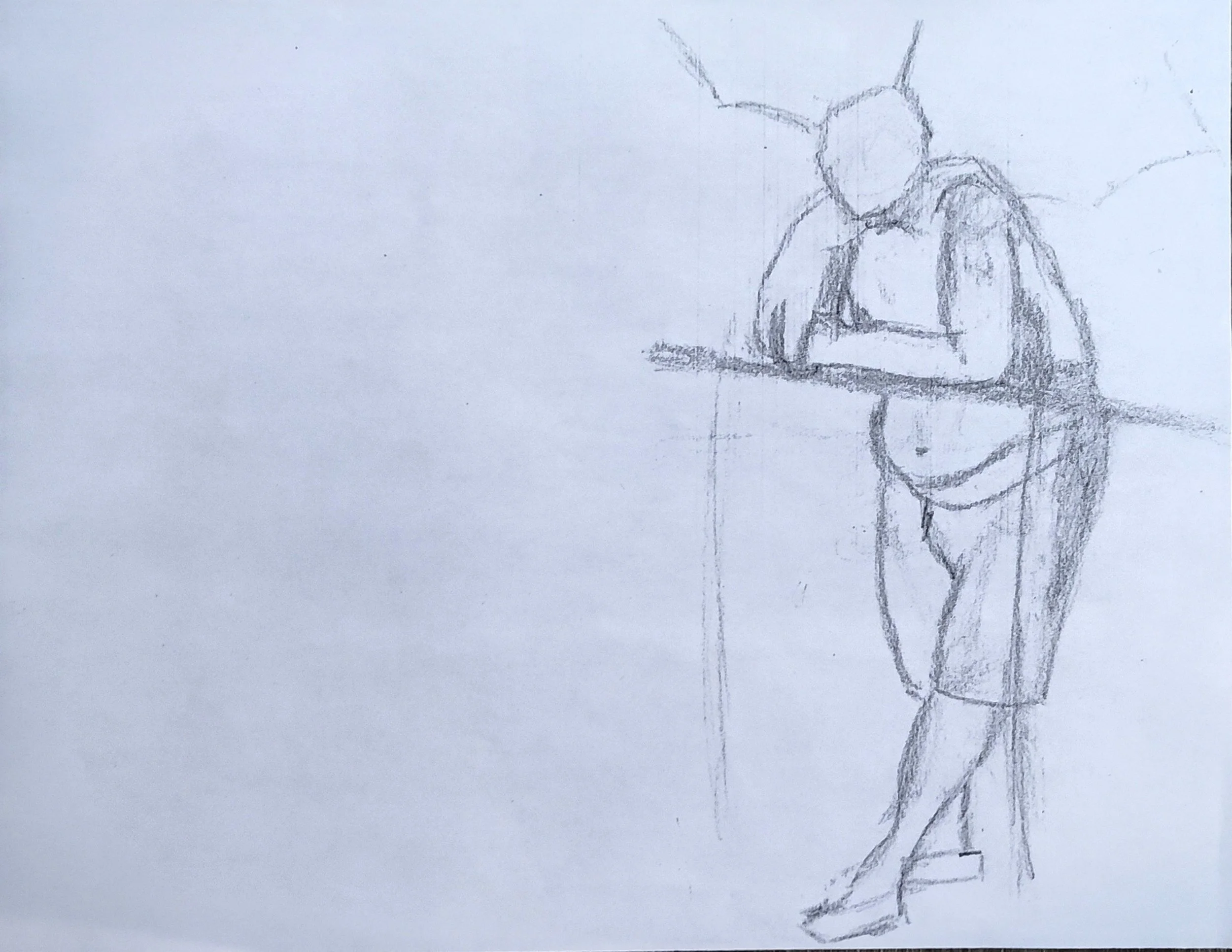
In this project, I was tasked with drawing a still life of two models with various props and then taking it home and drawing a different setting for the figures to be in. When me and my peers returned to class, we made copies of our drawings and then randomly swapped copies with another student. The piece I had made originally made was going to function as the beginning of a story, and the one I had received from another student was going to be how the story ended; I was tasked with creating an additional 6 drawings that where to function as the in-between snapshots of the story, which I had to create. All 8 drawing where made the same way, drawing one or two models in class and then drawing them in a setting at home. All of them where drawn on 8 1/2 x 11 paper with a variety of pencils.
I had started out with a dead guy and a girl looming over him, and had received what was almost a blank sheet of paper as my ending. Initially, I had no idea how to get from thread kingdom to white void but with a lot of thumbnails and requesting models to do weird poses I made it work. The plot, essentially is that the girl has killed the guy in the first page, only for him to come back from the dead. They become allies for a time, but it’s only a ruse for the guy to close enough to the girl to kill her for revenge. In killing the girl, the guy underestimated this powers and destroys reality on accident but I think he’s chill with it in the end.
-
![]()
Beginning - 8 1/2" x 11"
-
![]()
2 - 8 1/2" x 11"
-
![]()
3 - 8 1/2" x 11"
-
![]()
4 - 8 1/2" x 11"
-
![]()
5 - 8 1/2" x 11"
-
![]()
6 - 8 1/2" x 11"
-
![]()
7 - 8 1/2" x 11"
-
![]()
Ending - 8 1/2" x 11"


Study of Mary Magdalene
15 1/2” x 19 1/4” (2023)
This was a midterm assignment where we had to pick a classical painting and repaint it in a monochromatic color palette. The painting I chose was Mary Magdalene with The Smoking Flame by Georges de la Tour for the ambiance and the value range. Originally I had found the photo in a physical book from my college’s library, so for the sketch I drew a 1” grid onto vellum paper and then a 2” grid onto Bristol paper. I sketched the contents of each square from the 1” grid onto the paper grid and then went in with gouache paint, starting from lightest points to darkest.

(reference)

What My Dog Sees.
9”x 12” (2023)
This was a still life assignment where we had to paint a multi-colored display in monochrome. Originally, I had picked green monochrome because it’s my favorite color but about half way through I realized that I had used almost entirely just yellows and blues. Dogs are usually red/green color blind, meaning that they see everything in varying shades of yellow and blue; the idea that what I was painting would be how my dogs would see the display was super funny to me. I loosely painted my sketch in with watered down gouache and kept refining it with more and more opaque layers of gouache until I got to a point where I was satisfied with the piece.

Free Coffee
6” x 9” (2023)
This piece was one of my first genuine attempts at using watercolors to paint something not abstracted. Once again, a monochrome homework assignment. In the early days of my educational career I frequently hung out at the campus Methodist church because I liked the people there and they had free coffee which they served in little styrofoam cups with thin coffee straws. I remember my peers and I were sitting around a table and the light from the window was hitting the stack of coffee cups and my hat in a interesting way, so I took advantage of the opportunity to time capsule an era of my life. I chose a brown color because of the coffee cups, despite there being no coffee left in them.
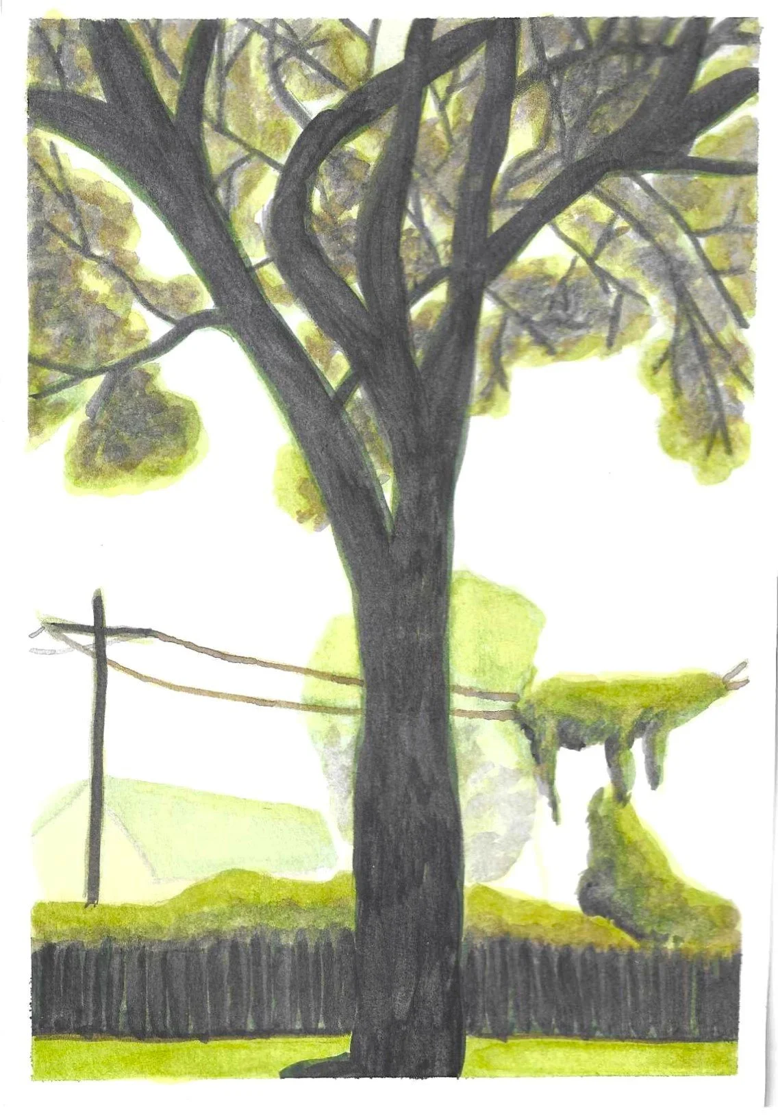
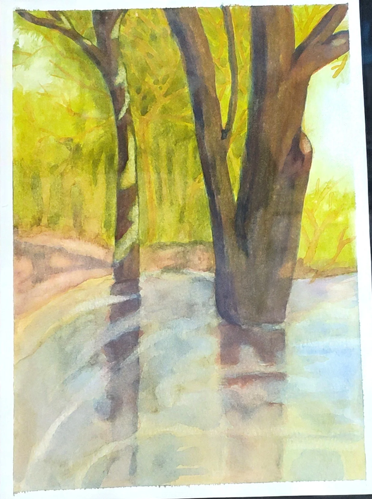
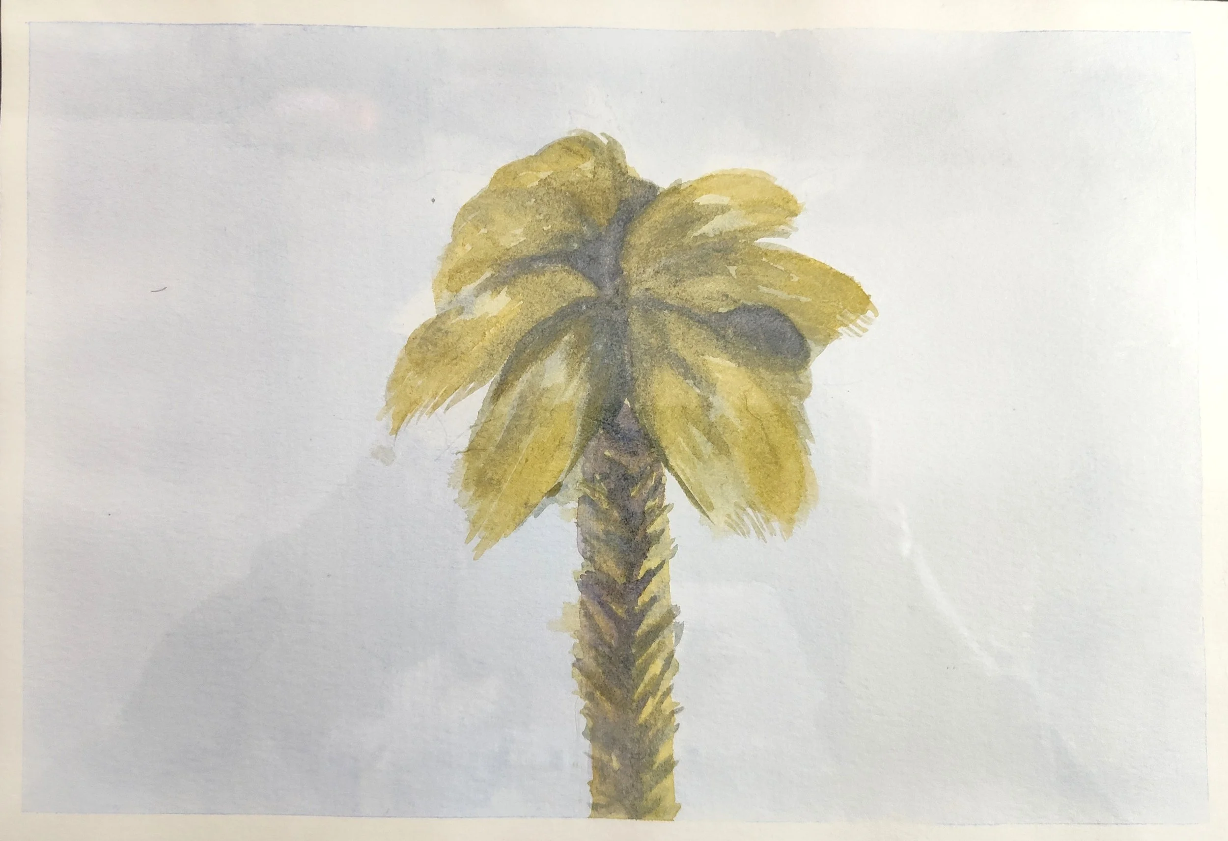
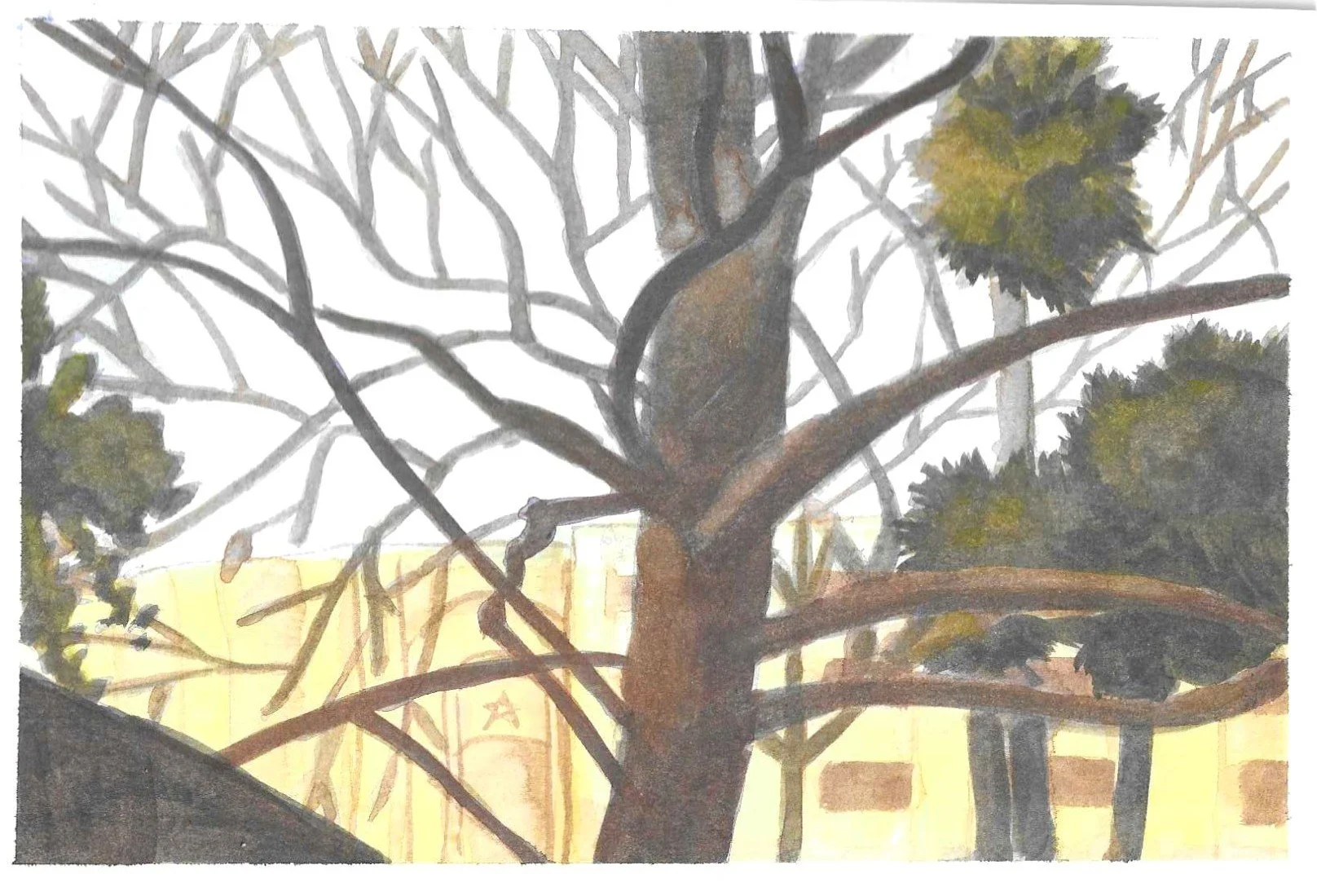
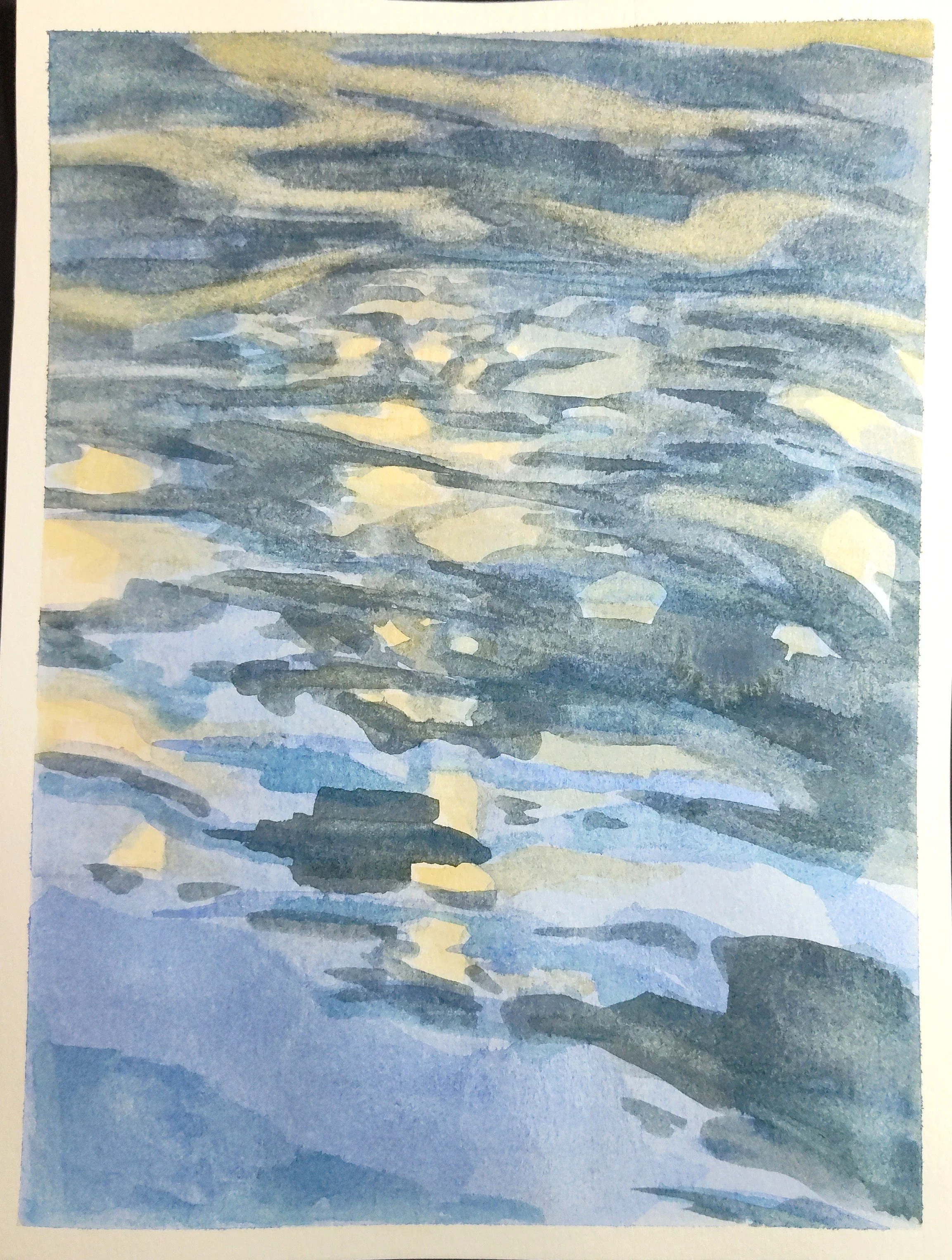
Landscape Studies
Sizing varies (2025)
As an artist, I’m a big fan of nature despite it not agreeing with my skin usually. When I took a watercolor class as an elective in college I was delighted by the task of painting a million landscapes. The course was online, so unfortunately we didn’t get to go outside and paint landscapes in front of us. Although having to rummage through my photo albums for landscape photos made this set of 10 paintings feel like a montage of places that I’ve been to or loved throughout my life. A few from my childhood home, the beach that me and my friends frequented every summer, the outdoors of Corsicana, where my mom was born, and some from vacations to San Antonio to visit my Abuelo.
-
![]()
11" x 7 1/2"
-
![]()
11" x 7 1/2"
-
![]()
7 1/8" x 7 1/8"
-
![]()
11" x 7 1/2"
-
![]()
11" x 7 1/2"
-
![]()
7 1/2" x 6 1/2"
-
![]()
7 1/2" x 9 7/8"
-
![]()
7 5/8" x 10"
-
![]()
11" x 7 1/2"
-
![]()
11" x 7 1/2"


Kitty Canon
9” x 12” (2025)

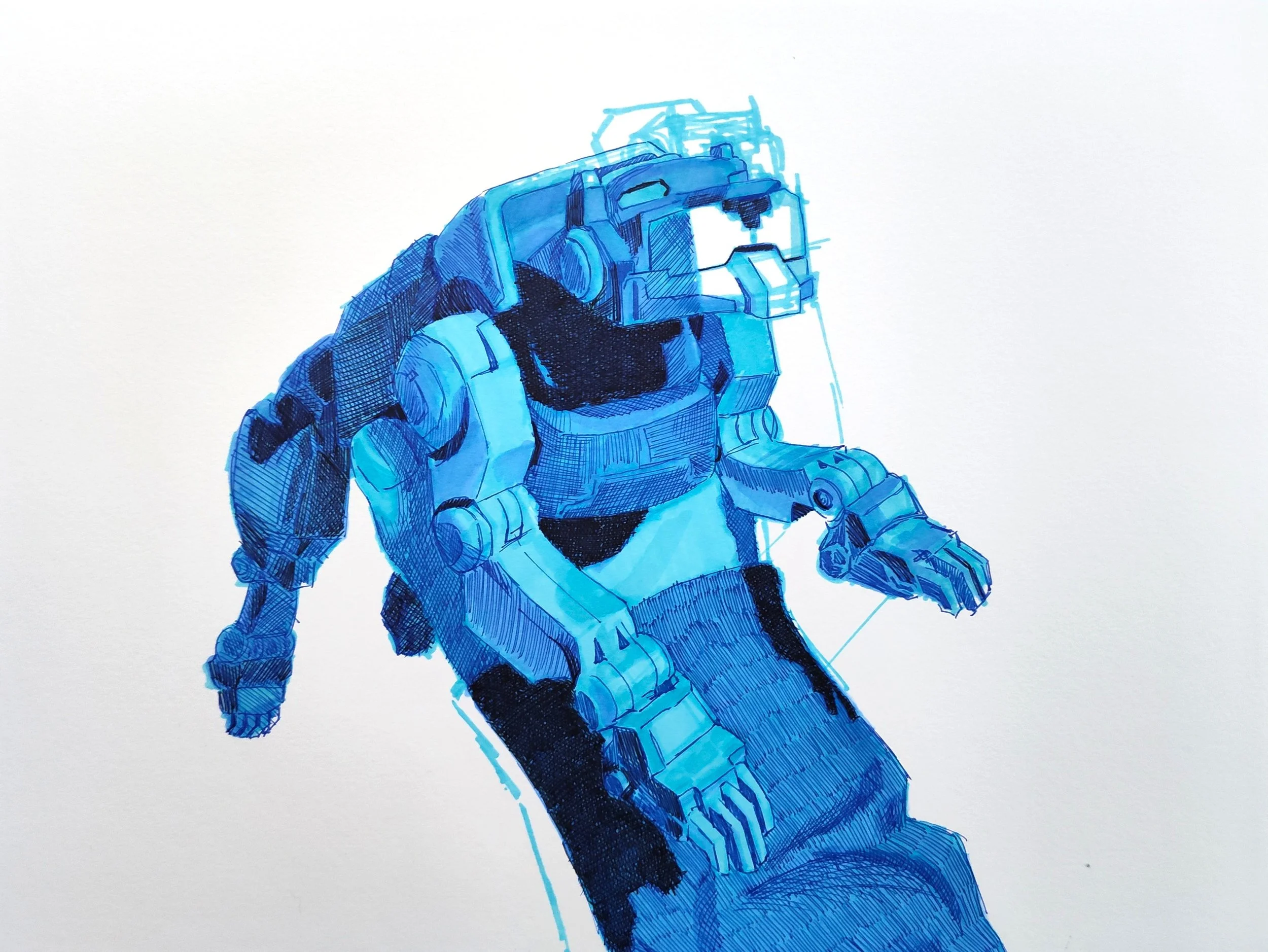

This series is comprised of three monochromatic color coded studies of my best friend holding my Voltron action figures. When the latest reboot came out, they redesigned the ships (like they do every reboot) but this time they weren’t all the same standard model in different colors; each ship had it’s own characteristics (overall size, different jaws, different back plates, etc.). I wanted these pieces to feel nostalgic so I picked bright colors (each color corresponds with the ships regular color) and I wanted the posing to look like someone was ‘playing’ with them. I knew from the start that I was only going to three because doing all five ships would involve completely dismantling my action figure book case. Since I wanted to do only three, I knew that I wanted one have a more centered composition and for the other two ships to be looking at the one in the center. I purposely pointed the light source at the ship’s muzzles so that they would be the lightest part of the image because I wanted the muzzles to be the focal point. I started by taking pictures of my best friend holding the toys, and then began to loosely sketch the image from my phone in light alcohol markers on Bristol paper. Once I got the main structures down, I went in with darker markers to block in my shadows and went over that with ball point pens for finer details and to hatch in even darker values that my markers couldn’t get to. When I had finished these studies I threw them into photoshop and tested out several backgrounds ideas and got rid of the unused sketch lines but I didn’t enjoy any of them. The negative space and visible sketch adds to the idea of these images being an old memory. You remember the toy, but maybe not the place you saw them, and even the toy gets ‘blurry’ in places; the sketch reads as the viewer’s brain trying to ignore the misremembered details. The title is a reference to my childhood, when I first showed my best friend Voltron at a sleepover when we were kids she yelled out “kitty canon!” when the ships started firing lasers out of their mouths and I fear it’s a core memory.
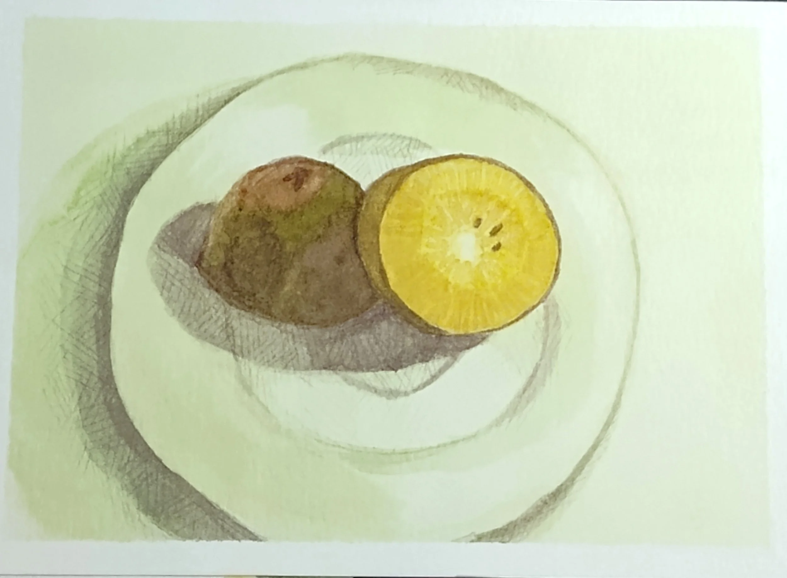
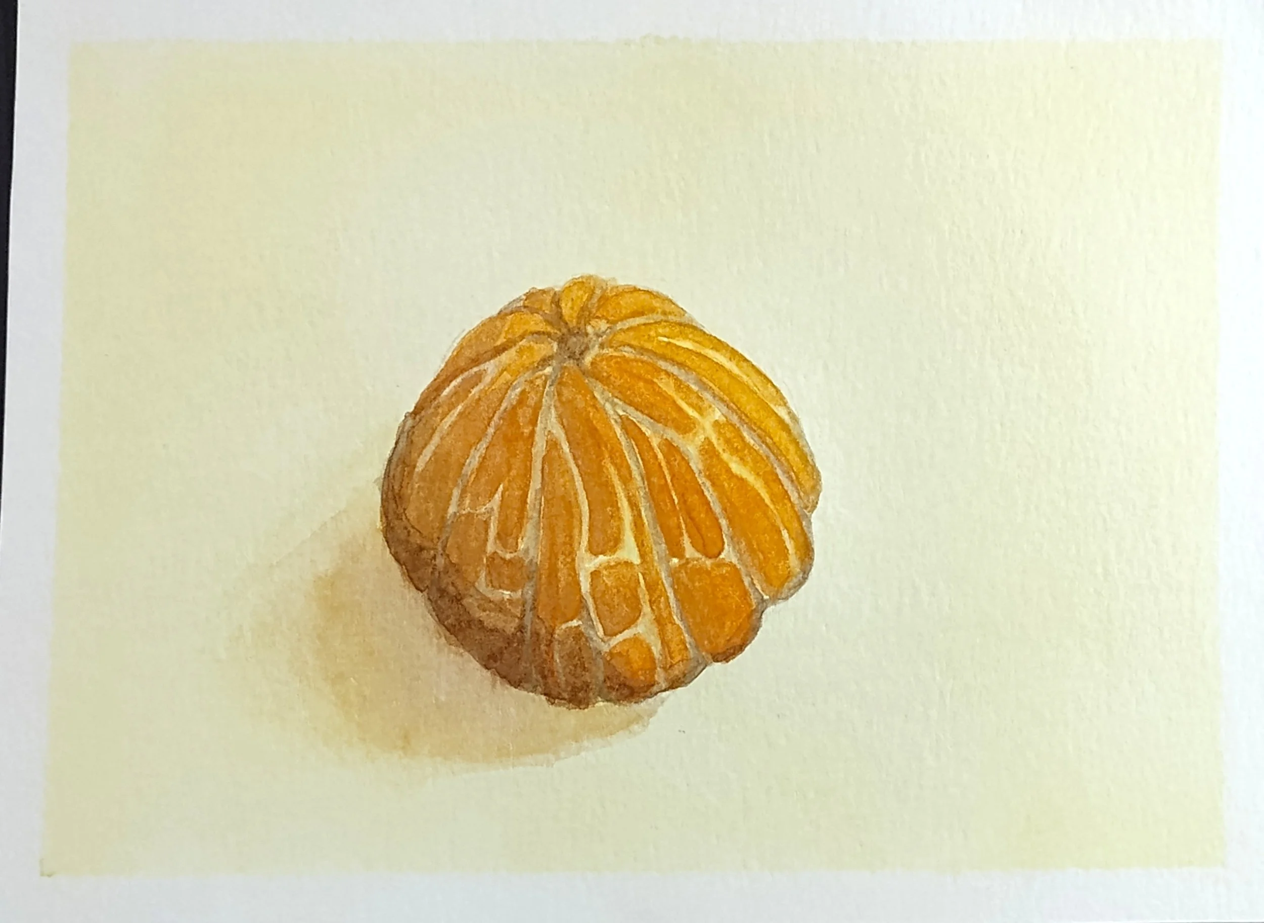
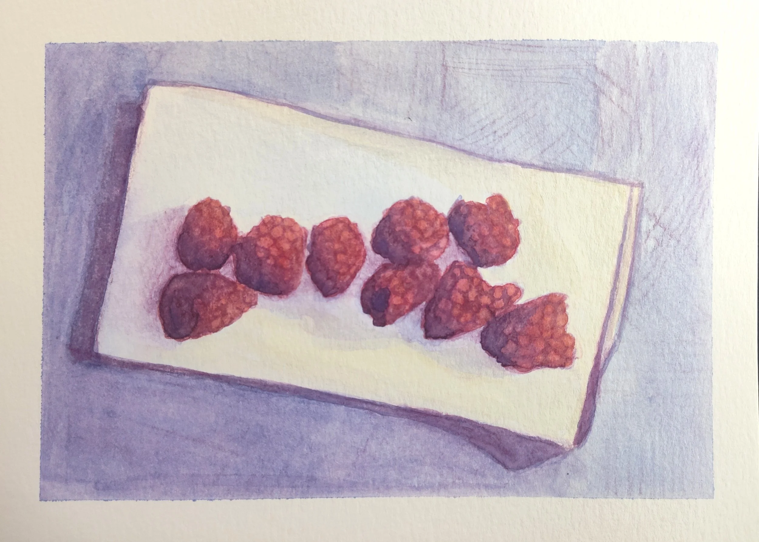
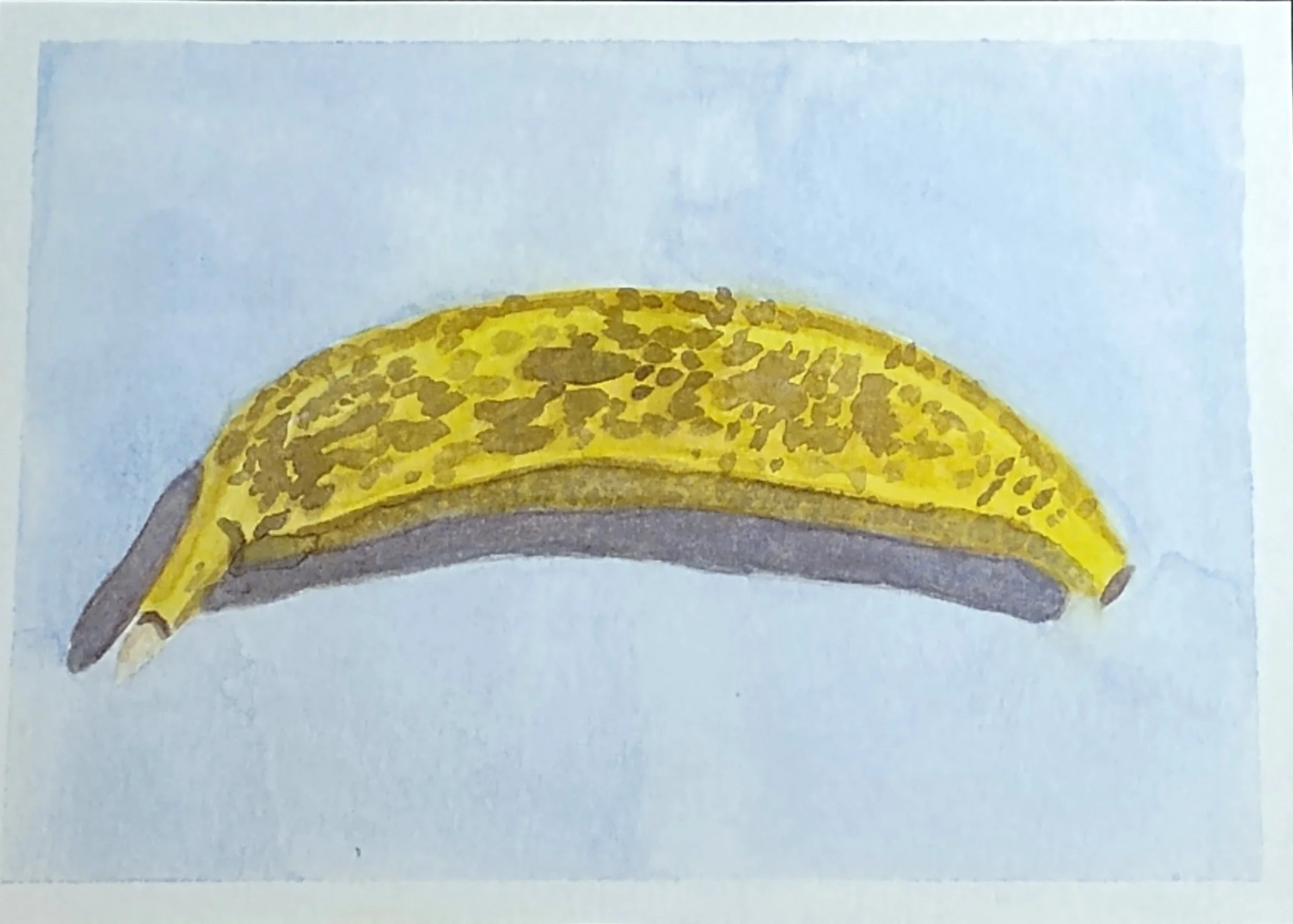
Fruit and Objects Studies
Sizing varies (2025)
This series contains watercolor still lives of different fruits. I sketched them on watercolor paper with various watercolor pencils and then went over them with, you guess it, watercolor paints. We were supposed to only use what we had in house for the assignment but I was completely fruitless therefore I went out and bought random fruits that I thought would be fun to paint.
-
![]()
7 1/2" x 5 1/2"
-
![]()
7 1/2" x 5 1/2"
-
![]()
7 1/2" x 5 1/2"
-
![]()
7 1/2" x 5 1/2"
-
![]()
7 1/2" x 5 1/2"
-
![]()
7 1/8" x 5 1/2"
-
![]()
7 1/2" x 5 1/2"
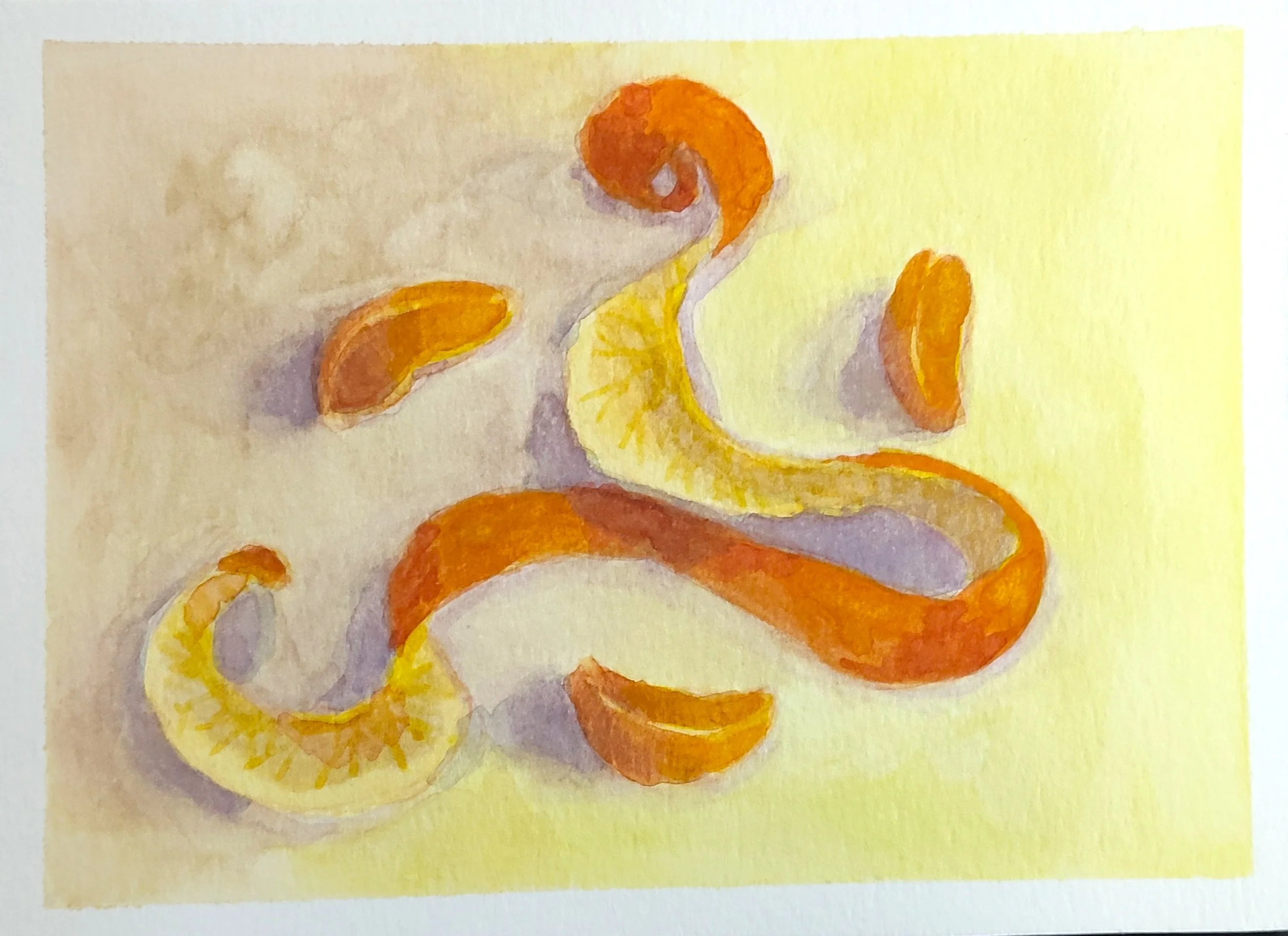


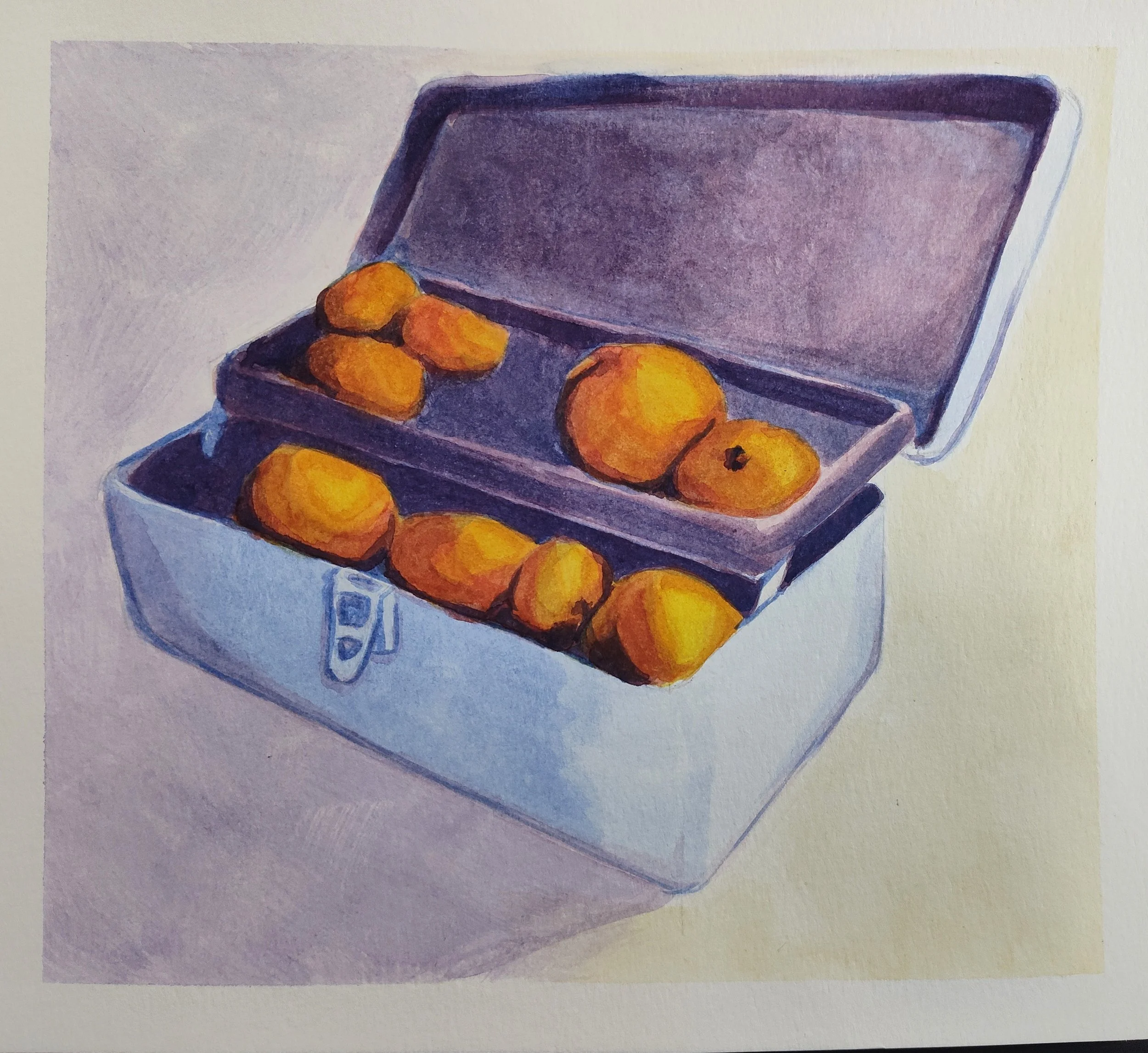
Fruit in Container
9” x 9 7/8” (2025)
This was the final for the fruit painting unit, I got to pick what fruit and what container but the professor had intentionally left the definition of “container” very loose to see what students would come up with from home. I used an old tackle box and a bunch of oranges (the fruit I had left over after eating a bunch of it.) I treated this piece the same way I did the smaller studies: light sketch with watercolor pencils and then an ethical amount of layers of cheap watercolor paints.