Typographic Spreads: Zuzanna Licko
two 11” x 17” spreads (four pages 8 1/2” x 11”)
This was an academic assignment where students were assigned a typographer, and then had to write a magazine article and design the page spreads for it. First is the finals and then the process in chorological order.
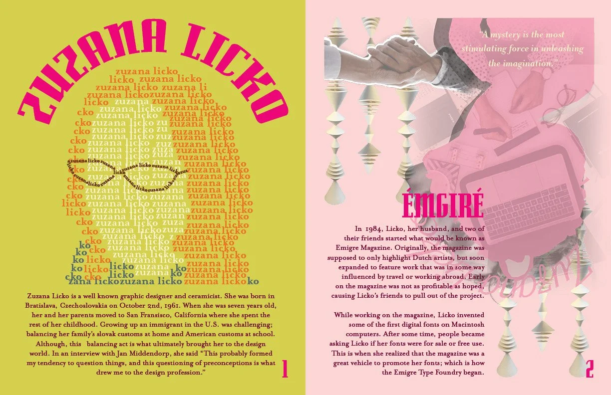
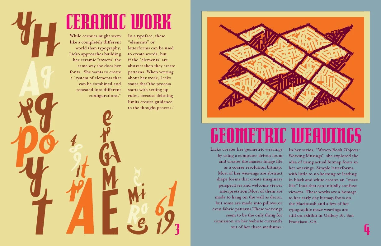
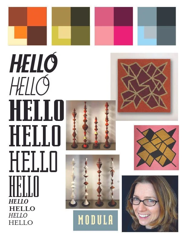
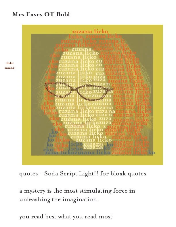
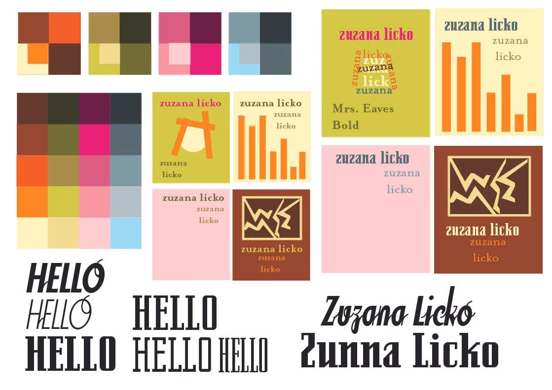
Later in my academic career, I got the opportunity to redo my first attempt at this assignment. I picked a completely different typographer and got to work. Unlike Morison, Licko had different bodies of work that I could research and include in my designing process. I started with colors again, I reviewed her portfolio and picked colors that reoccurred throughout it. For this work, all the fonts used where made by Licko; she has a larger and more available variety of fonts. I knew i wanted a introductory page and three pages themed around different bodies of work: Emgire Magazine, her ceramic tower series, and her geometric weavings. In the early days of Emgire Magazine, most of their covers were collages so I knew I had to make a collage in Photoshop for page two, referencing her towers and history of professionalism. For the ceramic and weavings pages, I created graphic renditions of her works using only letter forms (and some related words) in Adobe Illustrator and put all the components together in Adobe InDesign.
References:
“Creative Characters Interview with Zuzana Licko.” Edited by Jan Middendorp and Anthony Noel, MyFonts.Com, June 2016, www.myfonts.com/pages/newsletters-cc-201606?srsltid=AfmBOoo27Emhu1grqRSvmar51eYShZivCyM38pFZdxHEKOIdbcdaBd3L.
“Zuzana Licko.” Adobe Fonts, 2025, fonts.adobe.com/designers/zuzana-licko?cc=true&page=2.
Licko, Zuzana. “Artist Statement.” Zuzanalicko.Com, 2025, www.zuzanalicko.com/statement.php.