Typographic Spreads: Stanley Morison
11” x 17” (two 8 1/2” x 11” pages
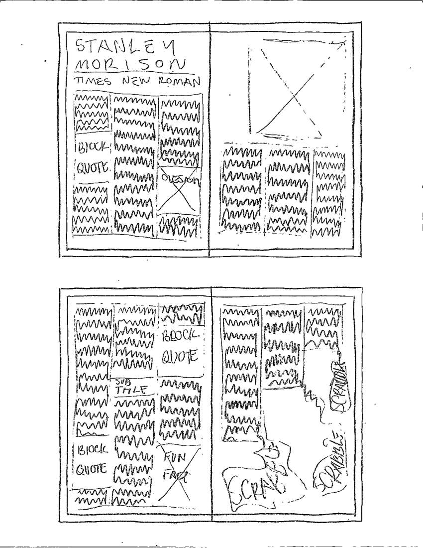
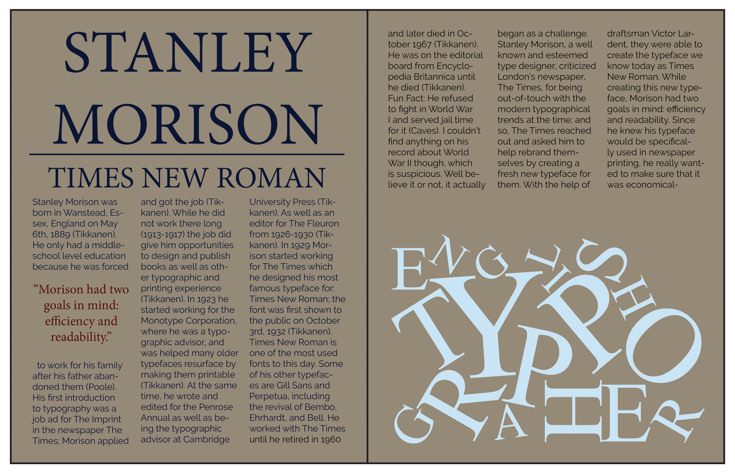
This was an academic assignment where students were assigned a typographer, and then had to write a magazine article and design the page spreads for it. First is the finals and then the process in chorological order.
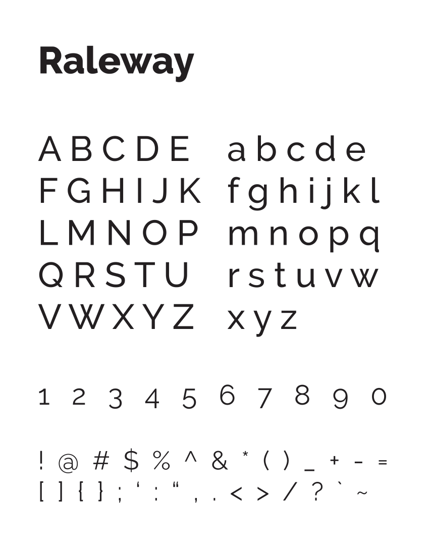
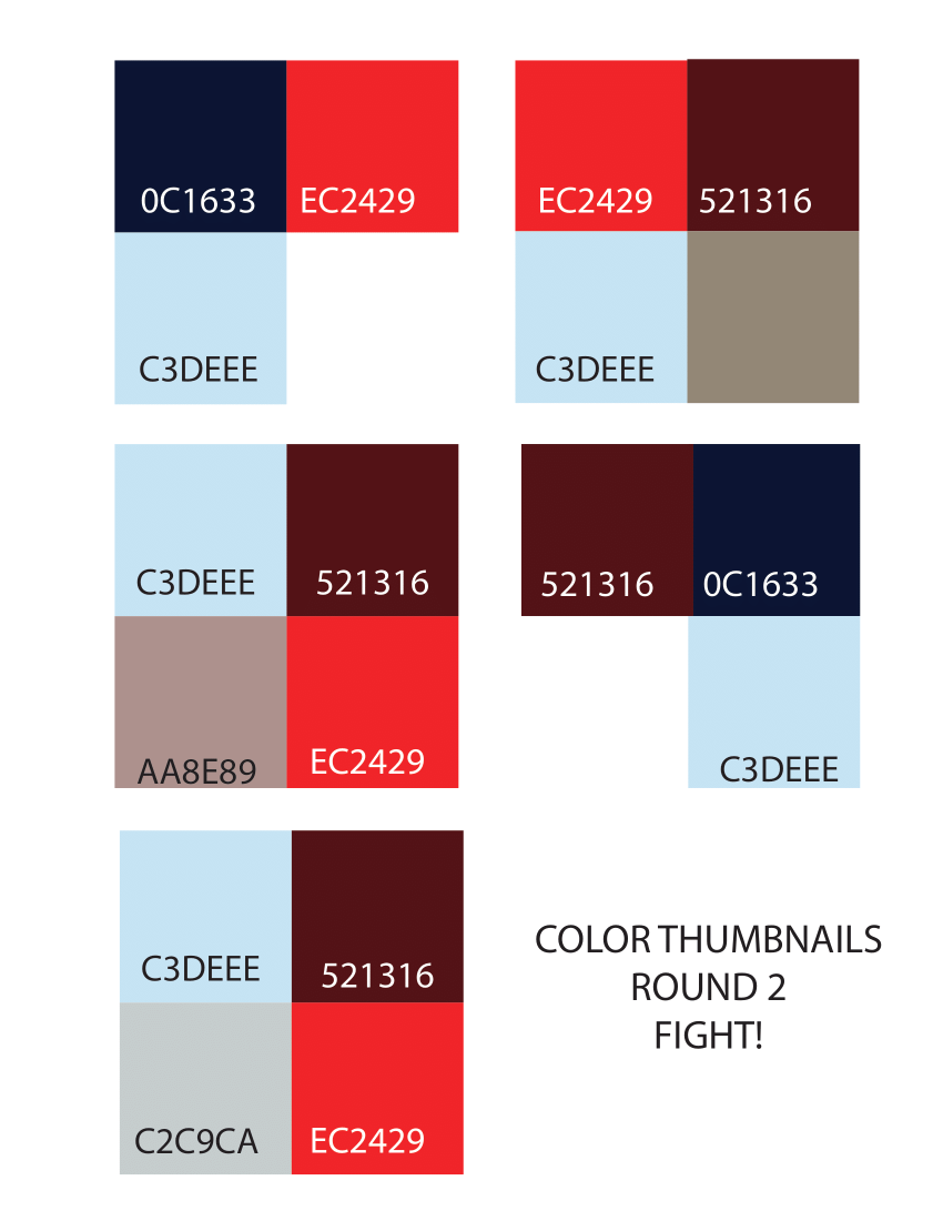
I started brainstorming colors first; I knew I wanted them to be clean, sleek, and professional feeling to match the style of the font itself as well as Morison. After much trial and error, I ended up with two muted terracottas and a muted light blue. Originally I had tried using Times New Roman for the body fonts as well but everything started to blend together. I picked Raleway to further the clean and sleek energy I wanted to capture. For the graphics I knew I wanted to showcase Times New Roman in a way it’s not usually presented; chaotic or erratic. I chose phrases or words that correlated with the content of the paragraphs and broke the words apart into scrambles in Adobe Illustrator and threw them into Adobe InDesign.