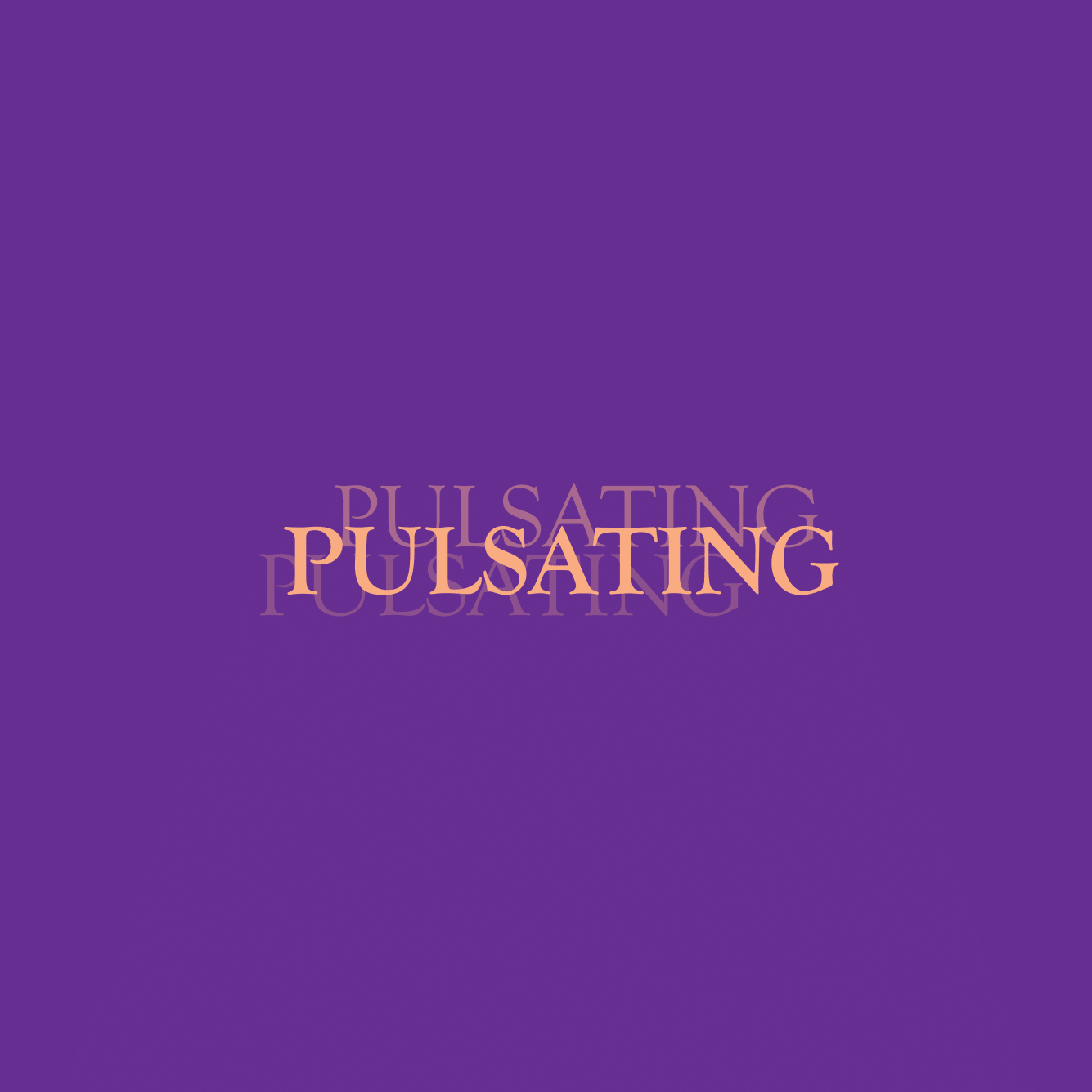
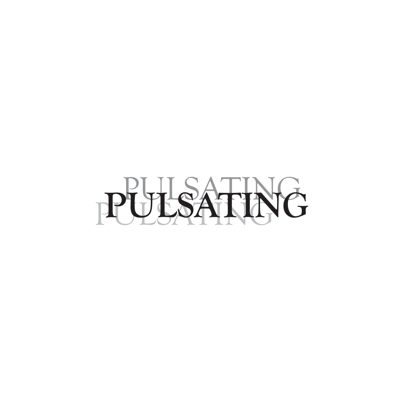
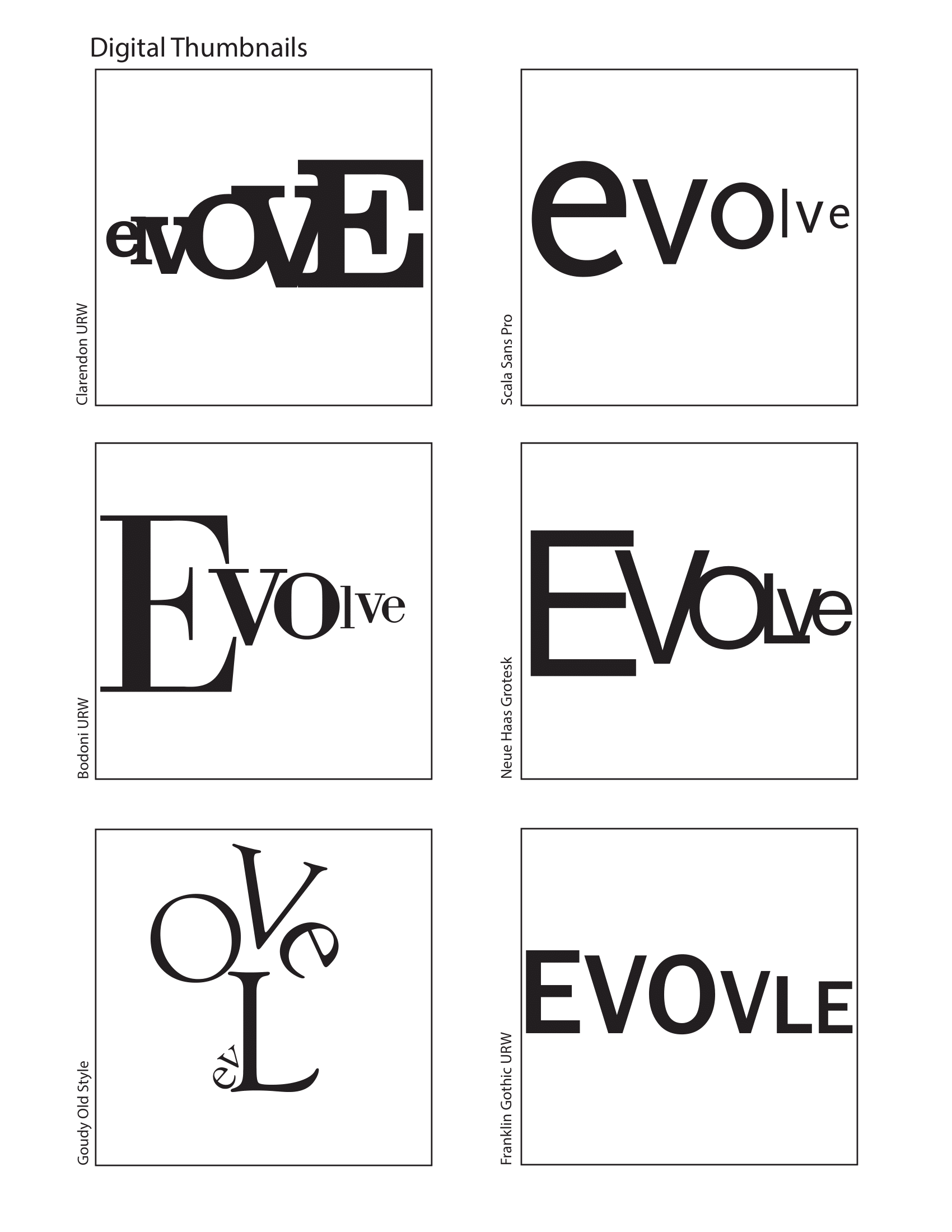
Expressive Words
12” x 12”
This was an academic assignment where students were assigned two words and then had to manipulate the type to convey the definition of the words.
I began doing word maps for each word, and then sketching out all the ideas that could best be demonstrated by the letters. For evole I went with a more simple design, inspired by evolution graphs for humans throughout the course of history (as in neanderthals to humans we know today). Initially for pulsating, my first ideas where based around hearts and heartbeats but I ultimetly went with a more vibrating look because some of my peers aat the time didn’t make the ‘heat beat = pulsating’ imagery I was going for.
As well as being given specific words, I was given a limited list of 6 font options to choose from for the final. I started my sketching for these by narrowing down that list to 3 and then drawing out the possible designs by hand in the typefaces. I narrowed down my designs and then digitized them for a cleaner look.
I knew almost immediately that I wanted to use green for evolve because evolve made me think of nature and most plants are green; I toyed with the idea of using some blues for the sky but ultimely I couldn’t find a blue and green that I enjoied that kept legibility. For pulsating I knew that I wanted colors with high contrast to strain the viewer’s eyes, adding to the pulsating affect of the piece.